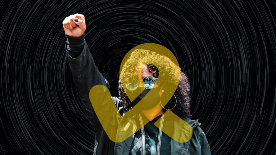
One of the reasons we re-branded was to have a branding that tells the story of our brand. So, in picking a logo, we were conscious. By a mere glance, our logo icon might look like every other icon out there, but best believe, it’s not like every icon out there.
We took some of the most essential visual representations of activism and put them in our logo.
Story 1:
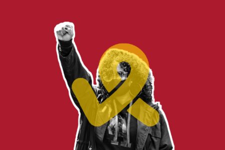
There’s one thing very common at the gathering of every movement for change since the beginning of time, and that is the raised fist for affirmation. We took that and made it into a simplified icon.
See image below:

Reason for use: It represents affirmation and people taking action.
Story 2:
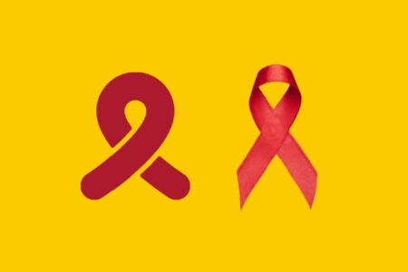
To raise awareness about some social issues, an awareness ribbon is used. So, we used an awareness ribbon in our logo icon.
See image below:

Reason for use: It represents awareness for social issues in the society.
Story 3:
We have talked about issues and actions, but they exist both negative and positive issues. So, to drive the message that we are fighting for the right issues, we used the right sign in our logo.
See image below:
Story 4:

We reserved the most emotional for the last. In million voices, a song released in 2005 by Wyclef Jean calling for unity after the Rwandan Genocide, you hear the African children choir sing:
“Ni dyar’izuba, Rizagaruka, Hejuru yacu
Ni nduzaricyeza ricyeza”
Which when translated to English means:
“When will the sun return above us?
Who will reveal it once again to us?”
So, we represented the song in our logo using a circle. We are revealing that sun to communities by solving social issues one action at a time. Join us.
Our logo was designed by our founder and executive director, Isaac Somto.
